SPC (Statistical Process Control) charts are used to measure changes in data over time. They help to overcome the limitations of RAG ratings, through using statistics to identify patterns and anomalies, distinguishing changes worth investigating (Extreme values) from normal variations.
The charts consist of:
-
A line graph showing the data across a time series. The data can be in months, weeks, or days- but it is always best to ensure there are at least 15 data points in order to ensure the accurate identification of patterns, trends, anomalies (causes for concern) and random variations.
-
A horizontal line showing the Mean. This is the sum of the outcomes, divided by the amount of values. This is used in determining if there is a statistically significant trend or pattern.
- Two horizontal lines either side of the Mean- called the upper and lower control limits. Any data points on the line graph outside these limits, are ‘extreme values’ and is not within the expected ‘normal variation’.
- A horizontal line showing the Target. In order for this target to be achievable, it should sit within the control limits. Any target set that is not within the control limits will not be reached without dramatic changes to the process involved in reaching the outcomes.
Normal variations in performance across time can occur randomly- without a direct cause, and should not be treated as a concern, or a sign of improvement, and is unlikely to require investigation unless one of the patterns defined below applies.
Identifying patterns
- Normal variation - (common cause) fluctuations in data points that sit between the upper and lower control limits that do not reach the criteria for a Trend.
- Extreme values - (special cause) any value on the line graph that falls outside the control limits.
- These are very unlikely to occur- and where they do, there is likely a reason or handful of reasons outside the control of the process behind the extreme value.
- A Trend - a trend may be identified where there are 7 consecutive points in either a pattern that could be; a downward trend, and upward trend, or string of data points that are all above, or all below the mean. A trend would indicate that there has been a change in process resulting in a change in outcome.
For example, on an SPC chart showing patient waiting times, there may be a run of 7 points below the mean. This indicates that there has been a change in the process, such as there are more appointment slots available than what there was previously (this would reduce the waiting times). This could be down to something like a new member of staff that has been recruited (increasing the potential appointments available), or appointment times have been shortened (meaning that more appointments can be booked in the same period).
Icons are used throughout this report either complementing or as a substitute for SPC charts.
The guidance below describes the meaning behind each icon.
If you require any of the following information in an alternative format, please contact the Communications Team on 01522 309194 or email lpft.communications@nhs.net.
| Normal Variation | 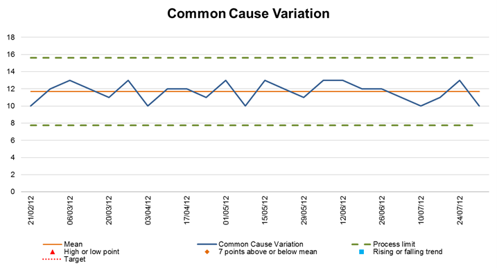 |
|
| Extreme values | 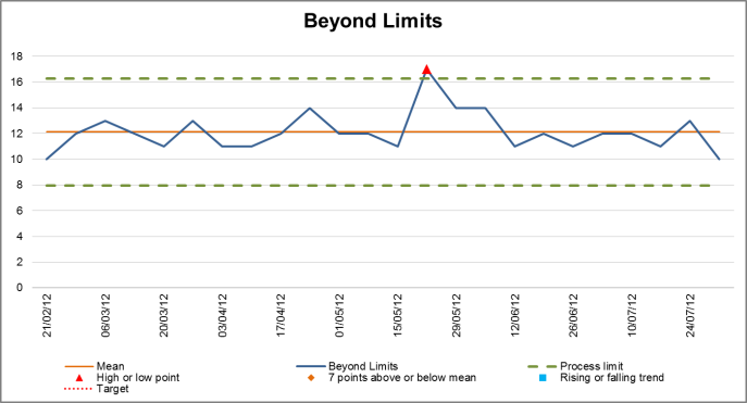 |
There is no icon for this scenario |
| A trend (upward or downward trend) | 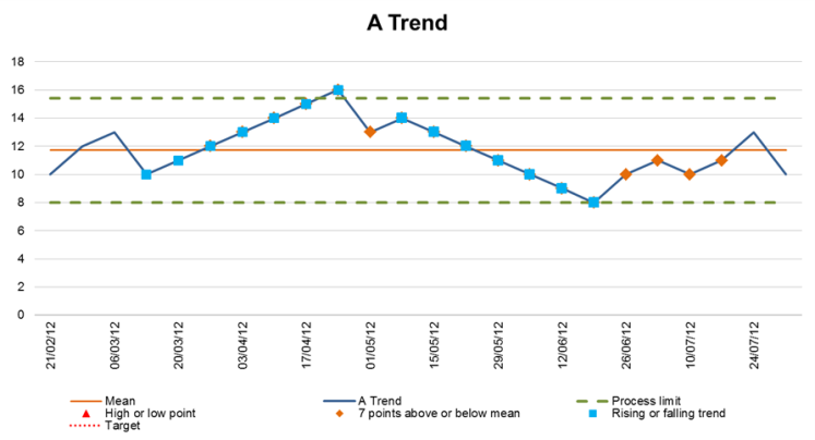 |
|
| Where a target has been met consistently | Where the target is expected to hit all of the time. | |
| Where a target has been missed consistently | Where the target is currently unattainable without a change in process. | |
| Hit and miss target randomly | Where a target is expected to be hit some of the time but normal variation would cause the target to be missed too. |
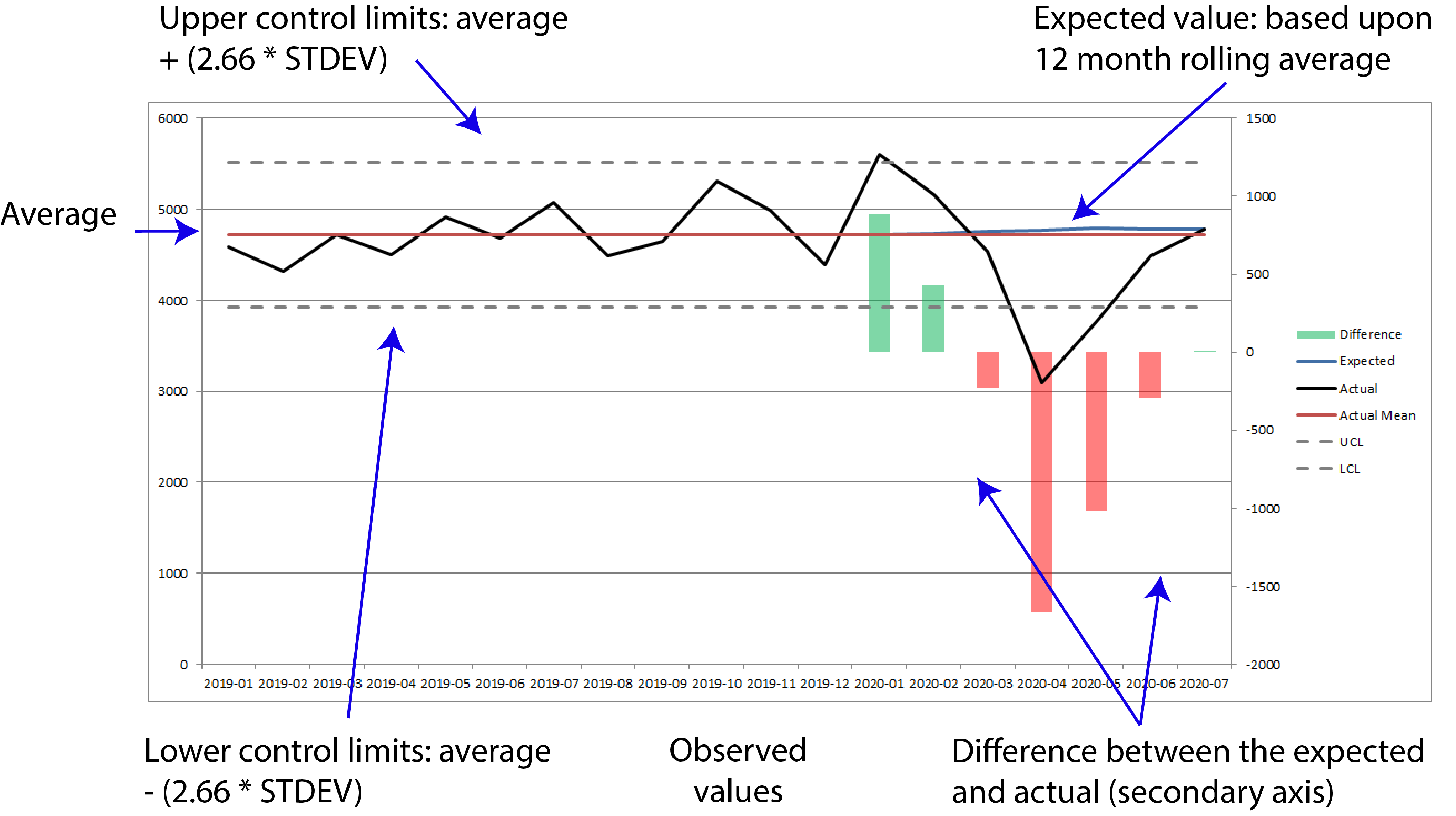
Reading demand charts
Below is a breakdown of the charts within our performance reports.